


Written on 15th May 2018
We’ve all been there: you’re on your phone and click through to a website, only to find it’s hard to read or burdensome to navigate because it isn’t formatted for a mobile screen.
With mobile phones increasingly becoming the primary way for people to search the Internet, Google wants to ensure that when you search, you find content that is not just relevant and timely, but also easy to read and interact with on smaller mobile screens.
A lack of mobile friendliness can be a problem for web sites owners: visitors abandon websites that aren’t mobile friendly at higher rates.

Research shows 74% of users say they are more likely to return to a mobile-friendly site.
That’s why we’ve been sending emails out to our clients, offering them solutions that will help their site get higher rankings, and in turn, more visitors that keep returning.
From April 21st, Google started to roll out a change to take into account whether a site is mobile-friendly when they rank search results on mobile phones. If you use Google search on your mobile phone, you can now more easily find high-quality and relevant results where text is readable without tapping or zooming, tap targets are spaced appropriately, and the page avoids unplayable content or horizontal scrolling.
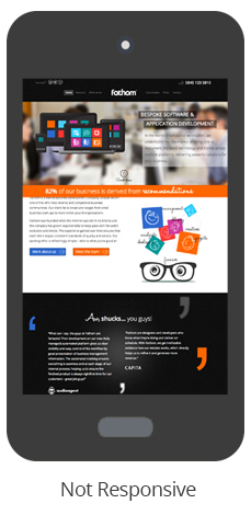
Google’s mobile ranking will now use mobile-friendliness as a signal that weighs in favour of pages that are formatted for mobile phones, like the image on the right. The good news is that it doesn't have to be expensive or time-consuming: from £500 + VAT, your site can be made mobile friendly.
What next? if you like what we do, get in touch to find out how our design agency can help you
Need our help?